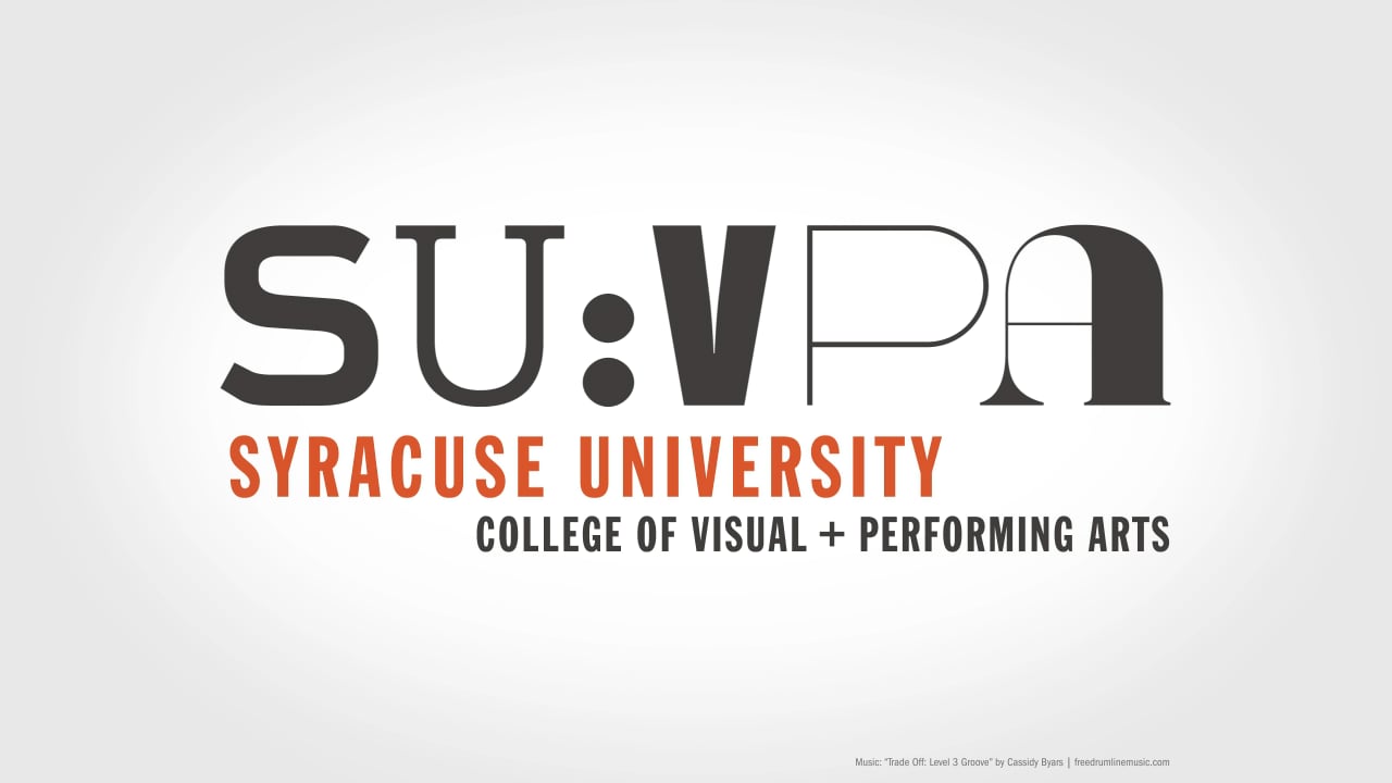
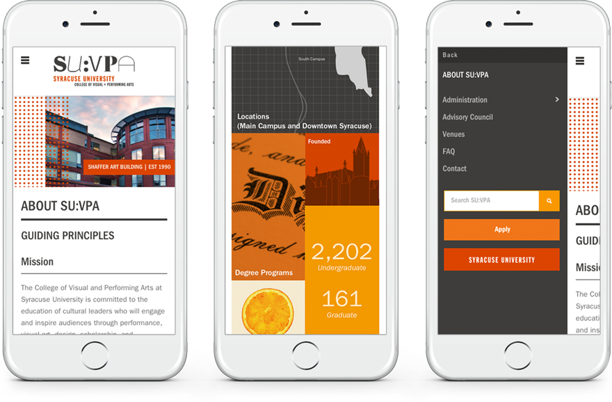
At Syracuse University’s College of Visual and Performing Arts, the whole is greater than the sum of its parts. The College is comprised of six academic divisions that are distinctly different within the arts. SU:VPA was ready to tell this story through a rebrand.
In the resulting solution, each academic speaks with their own tone of voice, and within the brand, they have been assigned their own unique typeface. Using a letterform from each, the eclectic composition of the College is reflected within the construction of the logo and variations. The result is energetic and bold and allows the academics to be specialized, while the College remains a collaborative environment.
Scope: Brand Audit, Research, Brand Strategy, Brand Identity, Logo Development, Print & Digital Design
Role: Creative Direction, Brand & Research Presentations, In-person Interviews, Information Architecture
Designed at Leibowitz
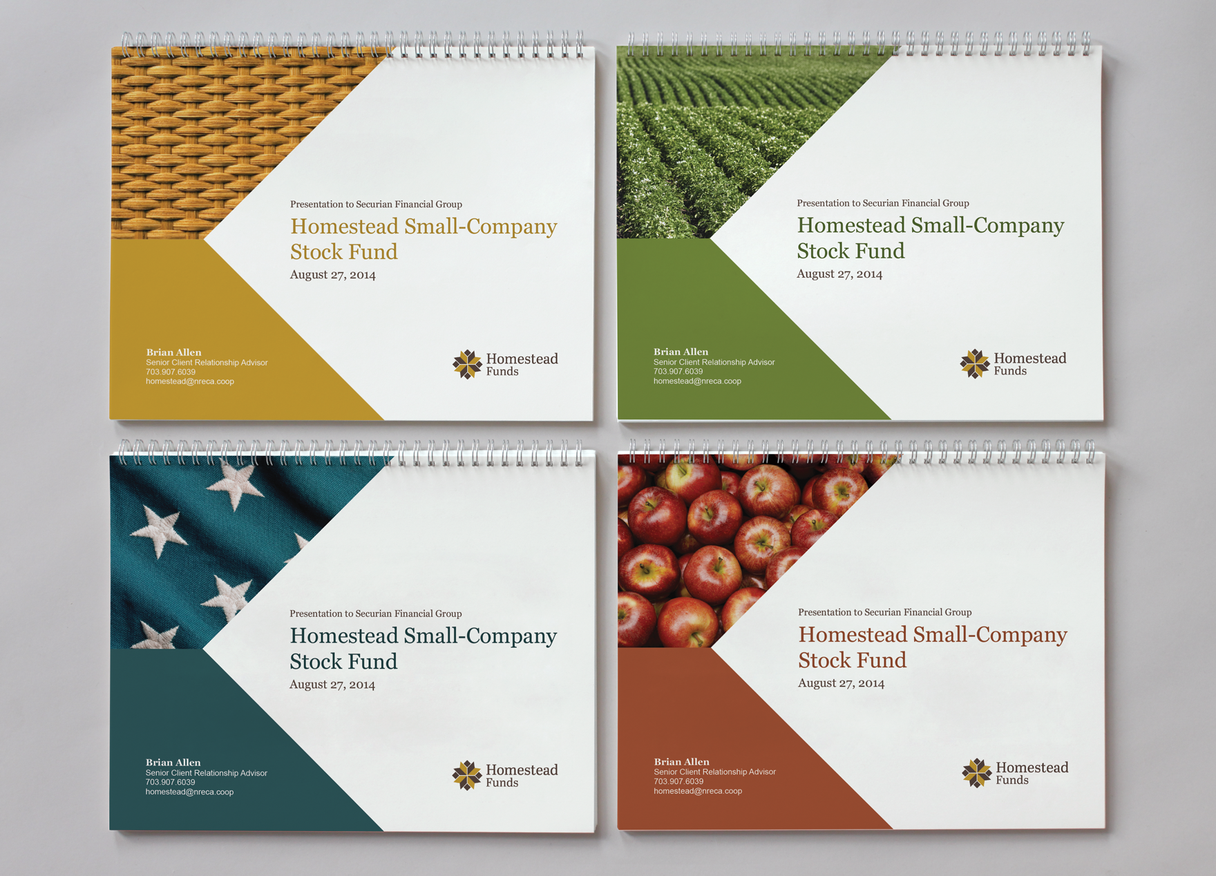
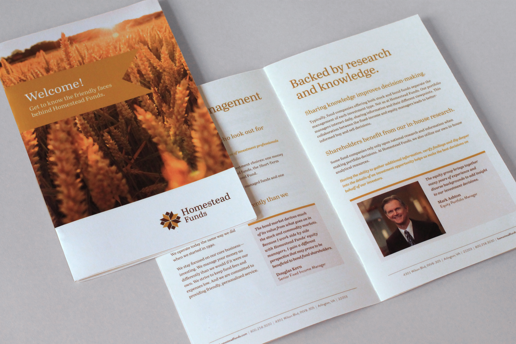
Homestead Funds is a mutual funds investment company with a unique story, initially launching to cater to members of the National Rural Electric Cooperative Association (NRECA). Due to a shift in audience, and a new corporate mission, Homestead was ready for a brand refresh. The result is a brand with homegrown roots, highlighting its history in rural American communities.
Scope: Brand Audit, Research, Brand Strategy, Brand Identity, Logo Development, Photography, Print & Digital Design
Role: Creative Direction, Brand & Research Presentations, In-person Interviews
Designed at Leibowitz
Perritt Capital Management is a Chicago-based mutual fund company whose focus is investing in micro-cap companies. For this rebrand, Perritt's core value of investing small is subtly highlighted in the logo, with the small blue dot cradled in the "i". Imagery focuses on larger-than-life small objects, juxtapositioned with illustrated, monochromatic patterns.
Scope: Research, Brand Strategy, Brand Identity, Logo Development, Illustration, Print & Digital Design
Role: Design, Art Direction, Brand Presentation
Designed at Leibowitz
Syracuse University College of Engineering and Computer Science found the editorial voice of its annual alumni magazine, the Syracuse Engineer, was becoming more dynamic and they were looking to match the design to that tone. With a complete redesign of the publication, the College aimed to resonate more deeply with alumni. The resulting design positioned the magazine as a resource every bit as smart and forward thinking as the institution behind it.
Scope: Design, Illustration, Information Architecture
Role: Creative Direction, Design
Designed at Leibowitz
Syracuse University expressed a need for a more unified alignment between the University and its sub-brands. The University was lacking guidelines for brand elements, and as a result, its Colleges, Departments and Programs became fractured and inconsistent. Through extensive research, a comprehensive brand guide, as well as sample applications, was created to give the University the tools it needed to implement a unified look and voice.
Scope: Brand Audit, Research, Brand Guidelines, Implementation
Role: Creative Direction
Designed at Leibowitz
Profit Investments, based outside Washington, DC, is a firm focusing on large-cap investing. Positioning for the rebrand was centered around their founder, Eugene Profit, and reflects their clarity of vision and team collaboration. DC-based imagery was chosen to emphasize their off-Wall Street location.
Scope: Research, Brand Strategy, Brand Identity, Logo Development, Photography, Print & Digital Design
Role: Design, Art Direction
Designed at Leibowitz
Athena Art Finance is a unique company in the marketplace providing flexible financing solutions using fine art as collateral. They required a brand directed toward high-net-worth individuals. The elegant gold logo is a simplified "A" monogram, which conveys strength, innovation and prestige. The brand utilizes imagery of gold frames to emphasize fine art lending and pairs with a rich color palette giving the brand an upscale and expensive look.
Scope: Brand Strategy, Brand Identity, Logo Development, Photography, Print & Digital Design
Role: Creative Direction
Designed at Leibowitz
Reich & Tang specializes in liquidity and cash management and over time has built highly adaptive white-label strategies for various audiences including banks, broker-dealers, advisors and institutions.
In order to highlight the flexibility and partnership they offer their clients, the R&T brand leverages a rotating ampersand in the logo. To further emphasize their commitment to partnership, rotating taglines incorporating the “&” (Flexible & Focused, Loyal & Committed) complement the logo and further establish their engaging personality.
Scope: Brand Strategy, Brand Identity, Logo Development, Print Design
Role: Creative Direction, Brand Presentation
Designed at Leibowitz
Matthews Asia focuses on the organization’s unique investment style and unparalleled level of expertise in Asia-based investments. They looked to tell their story in a compelling way with a corporate brochure.
The concept for the brochure centers on their singular focus on the Asian marketplace by emphasizing the exploration and the attention to detail they place on their investment decisions. To illustrate this concept, each spread incorporates an image of a well-known Asian landmark on the left, accompanied by a close-up detail of the same location on the right. Strict grids and symmetry reference Asian architecture and balance, while custom watermarks reflect the dragon logo. The brochure is printed on linen paper, which was inspired by Asian art prints and lends a textural feel to the piece.
Scope: Information Architecture, Concept Development & Design, Copywriting
Role: Design, Illustration, Art Direction
Designed at Leibowitz
The Measures of Effective Teaching (MET) project, founded by the Bill & Melinda Gates Foundation, was a three-year study designed to determine how to best identify and promote great teaching.
The identity for MET positioned the project as credible research within the foundation, utilizing bright color, simplified thought bubble graphics and educational imagery. Branding was applied to a suite of marketing collateral and a custom web application that included a pop-up for comments, signaling and aiding in dialog and communication to help drive participation in the project.
Scope: Brand Identity, Logo Development, Print & Digital Design
Role: Design, Art Direction
Time Warner Cable strives to connect with customers, communities and business partners by providing innovative entertainment and technology services.
Over the past 10 years, work for TWC includes supporting and expanding their existing brand with brand guidelines, advertisements, environmental signage, brochures, icons, web pages, bicycles and ice cream trucks.
Scope: Branding, Design, Environmental Graphics, Print & Digital Design, Logo Development, Brand Guidelines
Role: Design, Iconography, Art Direction, Creative Direction
Designed at Leibowitz
Logo development for various clients in the financial, retail, health, food and education industries.
Role: Concept Development, Design
Designed at Leibowitz & Freelance